Saturday 31 October 2015

Lighting


3 point lighting

Today I am going to be talking about 3 point lighting. 3 point lighting is used to make scene clearer when filming, so say a character is in a dark room you want to make the character face as visible as possible so you add a key light. When you add the key light one side of the character face is still a bit darker. So you add a fill light which is more focus and dimmer than the key light to the opposite side of the face. Giving the camera a clear image of the face but you cannot see the back or side of the face or even the background clearly so you add a back light which gives you a brighter clearer image.


High Key Lighting
A High Key is used to create a large amount of light around a subject which is linked to 3 point lighting.


Low Key Lighting
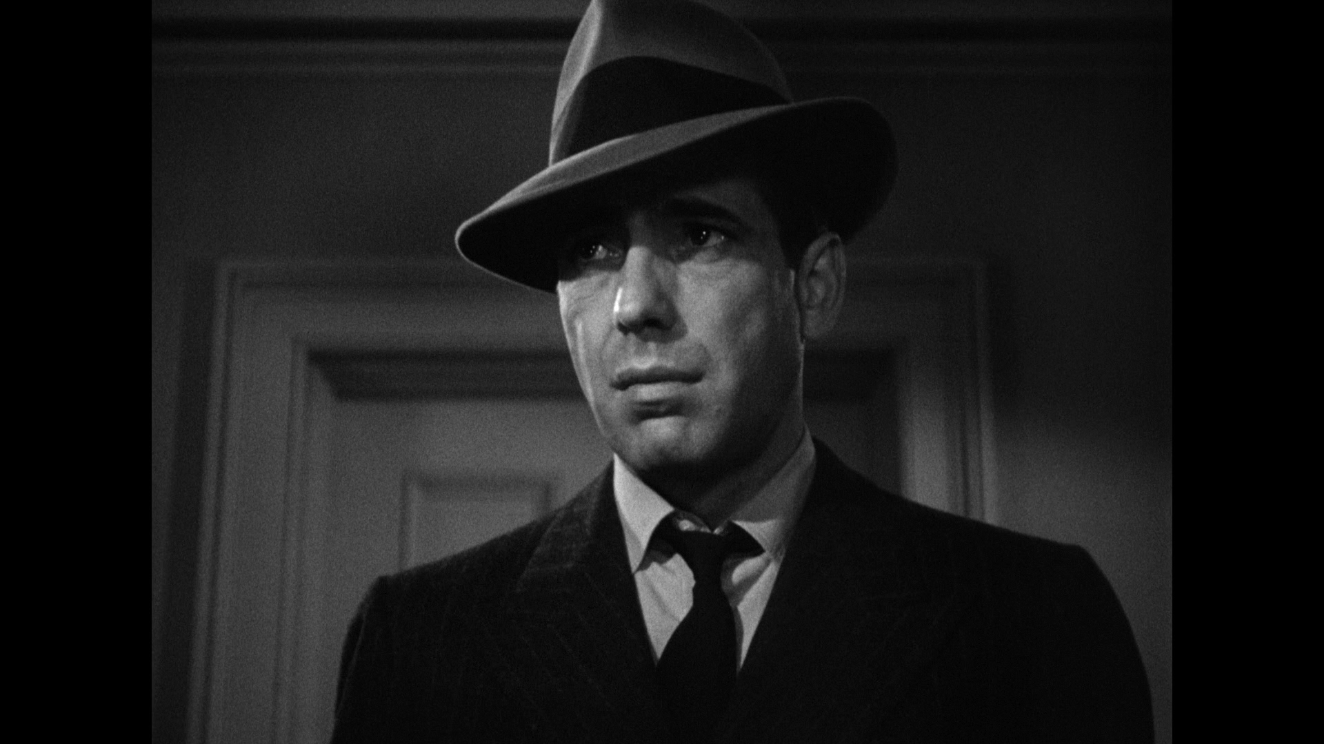
A Low key Lighting is using little amount of lighting which is used to create suspense in the horror or dramatic thriller genre.

Transitions

Straight Cut
An instantaneous cut between two shots can be used to move through within a scene or between a scene.

Fade in or out
The shot turns to or from black telling the scene has began or ended.

Dissolve
A merging between two shots signals a passing of time.

Wipe
A line wipes off one shot to the next; signal a move to a different scene.

Iris
The shot shrinks in a circle to the next shot; signal a move to a different scene.

Composition

Symmetrical
Symmetrical describes an image that is centralised and balanced, which creates an ordered and controlled meaning.

Asymmetrical
Asymmetrical describes an image that is imbalanced and not centralised, which creates a more realistic meaning.


Shot Size Types

Extreme close up
The object or subject covers the entire scene to show immense detail or in horror films the reaction of the character.

Close up
Similar to an extreme close up shot but instead its least zoom in but shows characters reaction or  in romantic film intimacy between two lovers.


Medium shot
A shot taken to about waist with nothing really important linked to its mainly used to show body language of a certain character or give the audience the chance to analyse the character.


Long Shot
This shot is giant zoomed out shot usual having the character in centre as well as most of the background in filming it is mainly used in establishing the scene.

Mise en Scene Part 3

Layout
House style- This involves the setting of certain standards for use of typography, layout, colours e.g for a certain brand/magazine/newspaper that remains consistent for ease of recognition by audiences.

Symmetrical describes an image that is centralised and balanced, which creates an ordered and controlled meaning.

Asymmetrical describes an image that is imbalanced and not centralised, which creates a more realistic meaning.

Columns and boxes- The use of columns for the copy and boxes helps create a sense of order for the text and helps the audience navigate their way through the text.

Ratio of copy, images and space- The ratio of copy to images and space on a page helps create meaning. More copy suggests it is for a more literary audience, more images are used for a more visual audience, and the extra use of space tends to be used for a more artistic audience.

Headline- This is the first and biggest statement in a magazine and other.

Caption- These are short statement  that help anchor meaning under images.

Strapline- This is normally a subheading for an article. The term is also sometimes used to refer to advertising slogan.

Standfirst- This is the first paragraph of an article that is usually in a slightly larger typeface and may be emboldened to draw the audience's attention to it. It will normally contain an eye-catching statement.

Colour
Housestyle- The use of dominant colours to create the house style of a band.
Colour saturation- The process of changing the colour level of images to create certain meaning and effects.
Choice of colour- The use of colour to create meanings and associations in a text.     

Mise en Scene Part 2

Image
Graphics- The use of logo design and motifs to create meaning for the audience
Depth of field- This occurs when the camera focuses on a certain part of a image
Digital manipulation- The use of digital effects to enhance and change the image.

Language
Formal and informal register- The use of language in the text to create either, a formal and official meaning for the audience, or one that is more informal and relaxed.
Slogan- This is a term used to refer to a line of copy on an advert.
Copy- This is the term used to refer to the actual text in an advert or article.
Direct mode of address- This text can refer to the audience using "you to engage them in the text.
Linguistic techniques- Something to catch the audience eye.

Typography
Serif and sans-serif typefaces
Serif typefaces are normally used for headlines and large texts, as serifs contain extra features added to letters to make them stand out.
Sans-serif typefaces are used for the main body of text, as they do not have the additional features and are therefore easier to read in smaller font sizes.
Specialist typeface-This involves using more elaborate and eye-catching typefaces than the traditional serif ones.
Font size/ Italics/ Bold/ Underlines- The size and style of the font will create meaning and emphasis for the audience. The larger it is, the more important it seems to be.

Rhythm

Slow Motion
This is where the action is slowed down from real time to help add a more dramatic/unrealistic feel to the scene.

Speeded up
This is where the action is sped up to add a more comedic feel to the scene or to signal the passing of time.